How to: Make the Perfect Search Control
I get it - you’re a new UX designer, you’re enthusiastic and bursting with ideas. You’re a revolutionary and you’re going to change the world. We were all there once, but let me tell you - plead with you - stop over-designing basic functions.
The search function has, over the years, often been over-designed. One common anti-pattern is hiding search behind a control to activate it. Slowing the user down and adding an extra step might remove an input field from your view, but at the expense of familiarity and ease of use.
If you’re offering your users a search function, then show them a text field with a search button.
If you’re using an icon, then use a “magnifying glass” icon.
This is the archetype and using anything else no longer makes any sense.

The ‘gold standard’ search control.
The placeholder text (“type to search” in the above example) is a vital and often overlooked piece of UI copy. In a couple of well-chosen words, the UX designer can give valuable hints and context to the user.
For example: “type to search” indicates to the user they’re searching a set of data (products, customers, and so on) — but “filter results” would indicate that they’re instead limiting the data set already in view.
Care should be taken with regard to accessibility; ensure that placeholder text is still readable and not low-contrast, and don’t replace perfectly good form labels with placeholder text. Placeholder text is an added “bonus” and not a replacement for form labels.
Instant search, where typing instantly shows results to the user, is often better than showing a separate search results page. Instant results are more immediate and can let the user navigate to a result without breaking their flow inside your product.
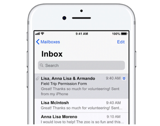
On a mobile phone screen, there may not be enough space to always show the search field, but I’d still encourage you to evaluate whether you can fit one in. Tucking the search field into the top of a scrolling view can work well.

Search at the top of this iOS List View only appears when “pulled down”.
Bonus points: when the user taps the Search tab in a mobile app:
- Show the search view,
- Move the cursor to the search field, and
- Show the device keyboard for them.
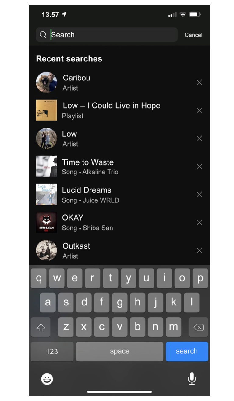
The Spotify mobile app does this particularly well:

Spotify’s excellent Search interaction.
Tapping Search in Spotify takes you straight to the search view with the input focused and the keyboard visible - and even includes your recent searches. Perfection! 🤌
Learning points
-
Search should be a text field with a search button
-
Only use the “magnifying glass” icon for search
-
Move the focus to the search field when the Search tab is tapped on mobile
This is an extract from the second edition of my Amazon best-selling UX book, 101 UX Principles: available to buy now.