6 Conversational UI Principles
Conversational user interfaces (CUI) are big right now, and they deserve to be: they’re focused, simple, and widely-understood by users.
Whether your CUI is backed by a simple script or a full-blown natural language processor and AI — here are some basic guidelines to follow for happy users and successful products.
1. Ask a question and then give the user the possible answers
Users don’t like an empty input field. Asking a user a question in a conversational user interface and then presenting them with a flashing cursor is an unhelpful pattern that tends to confuse users.
The exception is where we’re asking the user for a numeric or text entry like:
“What’s your name?” or,
“How much do you want to spend per night on a hotel?”.
This is an area where CUIs excel: we can ensure that the user only ever gets the most appropriate input method for the task in hand. Asking for a phone number? Pop open the device telephone entry keypad. Asking for confirmation? Show an ‘I understand’ button.
What’s more this approach forces us as designers to think about the best input method for the situation.
2. Break up ‘walls of text’ with pauses and confirmations
Users typically don’t read lots of text in any kind of UI, they tend to skim and look for keywords — at best.
If you’re explaining a complex concept then it may be best to fill up a part of the screen, pause, and wait for confirmation from the user before continuing. It creates a rhythm for the user and helps them feel in control of the journey.
Generally though, try to keep text short and punchy — stick to the same principles you’d apply in traditional UI design. Use the active voice over the passive voice where you can.
3. Allow users to easily correct mistakes
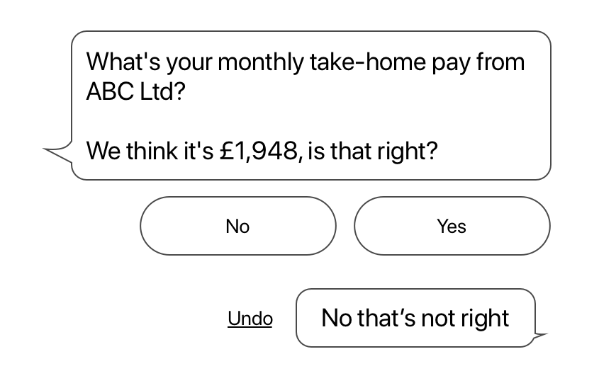
People make mistakes, usually 100s of tiny mistakes every day, and they will make mistakes in your product. If your user is operating a CUI there should be a simple way of them correcting mistakes — just like an ‘Undo’ button in a traditional point & click UI. There’s an example wireframe below of a really simple way to present something like this to the user.
 Providing an in-line ‘Undo’ control in a conversational user interface.
Providing a clear way to undo a mistake makes users feel more confident in using and exploring your product knowing they can go back and ‘fix’ mistakes.
4. Use emoji as separators and as shorthand 👍🏼
Emoji are the most widely recognised icon set on Earth. They may not be appropriate for every product or situation, but definitely consider using them in a CUI.
💬 Emoji are primarily used in messaging, of course, but more than that: they’re familiar. Users will have encountered them many times before and be familiar with their meanings.
😃 They’re also a little playful and can help ‘humanise’ an otherwise cold, procedural conversation. Use in conjunction with #2 (above) to break up ‘walls of text’.
5. Give the user one task at a time
One of the benefits of CUI — whether proponents of the interface realise it or not — is that it’s quite ‘old school’ in its approach: it asks the user one thing at a time, rather than giving them a palette of controls and questions.
In many ways CUIs are closer to command line ‘text adventures’ of the 1970s and 80s than today’s multi-touch gesture-based touch screens. The ‘old school’ vibe is no bad thing: asking a user one thing at at time focuses their attention, reduces errors, and can even help instil a sense of trust and competency.
6. Use inline expandable media
A complaint about CUI can be that they are a little restrictive — how do we show images, video or interactive media — or anything that’s not text? The answer is handily lifted straight from the interfaces of WhatsApp, iMessage and so on — inline expandable media. If you receive a video from a friend, you tap it to expand, play, manipulate it — and then close the media ‘modal’ once you’re done. It makes sense to display the media in a modal view, allowing the user to do what they wish and then return the focus back to the conversation.
These interfaces and experiences are relatively new but can deliver serious usability benefits for your customers. It’s going to be exciting to watch over the next few years as these interfaces mature from iteration and testing. Consider if there are interactions within your product that would be better served by a CUI. 👋🏼