Don’t Join the Dark Side
People check their smartphones a lot. One reason for this is that, in some way, it’s a kind of ‘gamble’. You check your phone and maybe there are no notifications or maybe there’s a ‘red blob’.
Maybe someone’s liked your Facebook post or someone’s ‘faved’ your Instagram picture of your brunch or your pet.
Each time you get a notification, you feel happy: your brain releases a little bit of dopamine. So you wait a little while and you check your phone again, hoping for the same result and reinforcing the addictive behavior loop.
This isn’t an accident. Many modern products, especially in social media, are designed to be addictive. In Hooked: A Guide to Building Habit-Forming Products, psychologist Nir Eyal proposes the Hook model:
“The Hook Model — a four-step process that, when embedded into products, subtly encourages customer behavior. Through consecutive ‘hook cycles,’ these products bring people back again and again without depending on costly advertising or aggressive messaging.”
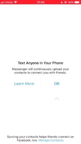
In order to not send your contacts to Facebook, you need to tap “Learn More.”
Next, there are so-called ‘dark patterns’ (see image above), which are UI or UX patterns designed to trick the user into doing what the corporation or brand wants them to do.
These are, in a way, exactly the same as the scams used by old-time fraudsters and rogue traders, now transplanted to the web and updated for the internet age. You’ll definitely have come across some of these:
-
Shopping carts that add extra ‘add-on’ items (like insurance, protection policies, etc.) to your cart before you check out, hoping that you won’t remove them
-
Search results that begin their list by showing the best item they’d like to sell you instead of the best result
-
Ads that don’t look like ads, so you accidentally tap them
-
Changing a user’s settings: edit your private profile and if you don’t explicitly make it private again, the company will switch it back to public
-
Confirmation screens, where you have to uncheck a ton of checkboxes just right to actually unsubscribe
-
Software in the engine management computer which checks if the vehicle is being emissions tested and, if so, lowers the performance and emissions ;)
And so on. There are hundreds. Please don’t do any of them.
This mobile banner ad has a ‘speck of dirt’ on the image, in the hope that the user will accidentally tap when they try to remove it.
In some fields, medicine for example, professionals have a code of conduct and ethics that forms the core of the work they do. Building software does not have such a code of conduct, but maybe it should do.
All of these dark patterns and addictive products were designed by normal people working in normal software companies — they had a choice. They chose to fight for the company, not the user.
Be a good UX professional, fight for the user and don’t join the dark side.
This is an excerpt from: “101 UX Principles: A Definitive Design Guide” which is available now.